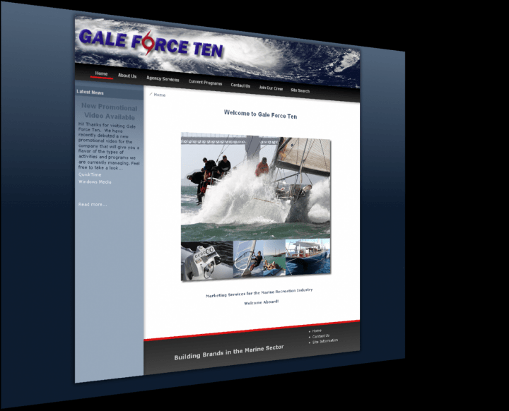
Gale Force Ten Logo Design
 The Gale Force Ten logo was a fun project. They knew exactly what they wanted and we were able to give it to them. The term Gale Force Ten is a rating of the wind and because Gale Force Ten is a firm that caters to the sailing industry, we wanted to make sure that the branding was targeted and would allow for quick recognition.
To accomplish this we incorporated the Hurricane symbol into the name of the company in the place of the "O" in fOrce.
Then to accentuate the meaning, we place the logo over an image of a Gale Force Ten storm over the ocean. The effect was very dramatic.


